library(tidyverse)
library(fivethirtyeight)
library(ggthemes)
library(janitor)
library(lubridate)
# data("comic_characters") # this used to work
# now it's more complicated to get the data
comic_characters_dc <-
"https://github.com/fivethirtyeight/data/raw/master/comic-characters/dc-wikia-data.csv" |>
read_csv() |>
clean_names() |>
mutate(publisher = "DC")
comic_characters_marvel <-
"https://github.com/fivethirtyeight/data/raw/master/comic-characters/marvel-wikia-data.csv" |>
read_csv() |>
clean_names() |>
mutate(publisher = "Marvel")
comic_characters <-
comic_characters_dc |>
bind_rows(comic_characters_marvel) |>
separate(first_appearance, c("year2", "month"), ", ", remove = FALSE) |>
mutate(
# If month was missing, set as January and day as 01:
month = ifelse(is.na(month), "01", month),
day = "01",
# Note some years missing:
date = ymd(paste(year, month, day, sep = "-")),
align = factor(
align,
levels = c("Bad Characters", "Reformed Criminals", "Netural Characters", "Good Characters"),
ordered = TRUE
)
) |>
select(publisher, everything(), -c(year2, day))Copy the masters
For this assignment, we’ll be reproducing graphics from FiveThirtyEight. I chose FiveThirtyEight for a couple of reasons. First, I think they make very clear data graphics. And then perhaps more importantly, they make their data public, so it will be easier for us to reproduce their work.
Picking a graphic
For the first step of this assignment, you will be identifying a graphic you want to reproduce. Start at the Our Data page and find a graphic that interests you and you think is possible to reproduce. This is mostly a “thinking step,” rather than a coding one, although you may want to start playing around in ggplot2 to see if your guess is right. Plots that will be easier to reproduce are the more standard ones (histograms, line charts, scatterplots, etc). I looked through quickly and thought the following would be pretty doable:
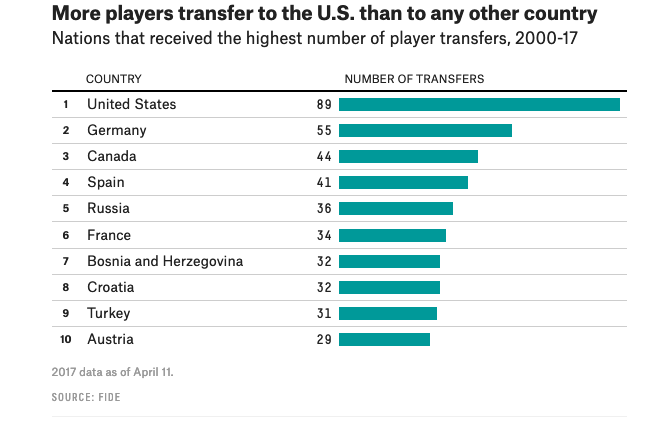
- More players transfer to the US than to any other country from American Chess Is Great Again
- Hurricane Maria and Puerto Rico got comparatively little online coverage, from The Media Really Has Neglected Puerto Rico (others look doable, too)
- Do you think that society puts pressure on men in a way that is unhealthy or bad for them? from What Do Men Think It Means To Be A Man? (others look doable, too)
- Trump is less popular than leading Democratic candidates, from The Democratic Presidential Candidates Are Becoming Less Popular
Potentially doable:
- Sandy-related calls to 311, from The (Very) Long Tail Of Hurricane Recovery
- Biden’s Ukraine-related media bump is fading, from The Media Frenzy Around Biden Is Fading
On the scale of hard-to-not-doable:
- Peter and Dean are Neck and Neck, from Rachel’s Season Is Fitting Neatly Into Bachelorette History
- The Rise of the Trinity from American Chess Is Great Again
All of these may require a bit of data wrangling before you can get to the graphing data part. I had intended to push off data wrangling for a bit, but it looks like we’re going to need to talk about it!
You can’t choose either of the first two graphics from Comic Books Are Still Made By Men, For Men And About Men, because I’ve used that as an assignment recently and will be using it as an example.
Initial idea
For your initial idea, you will pick a graphic and submit the image of the graphic as well as a piece of pseudocode to produce the graphic.
Example
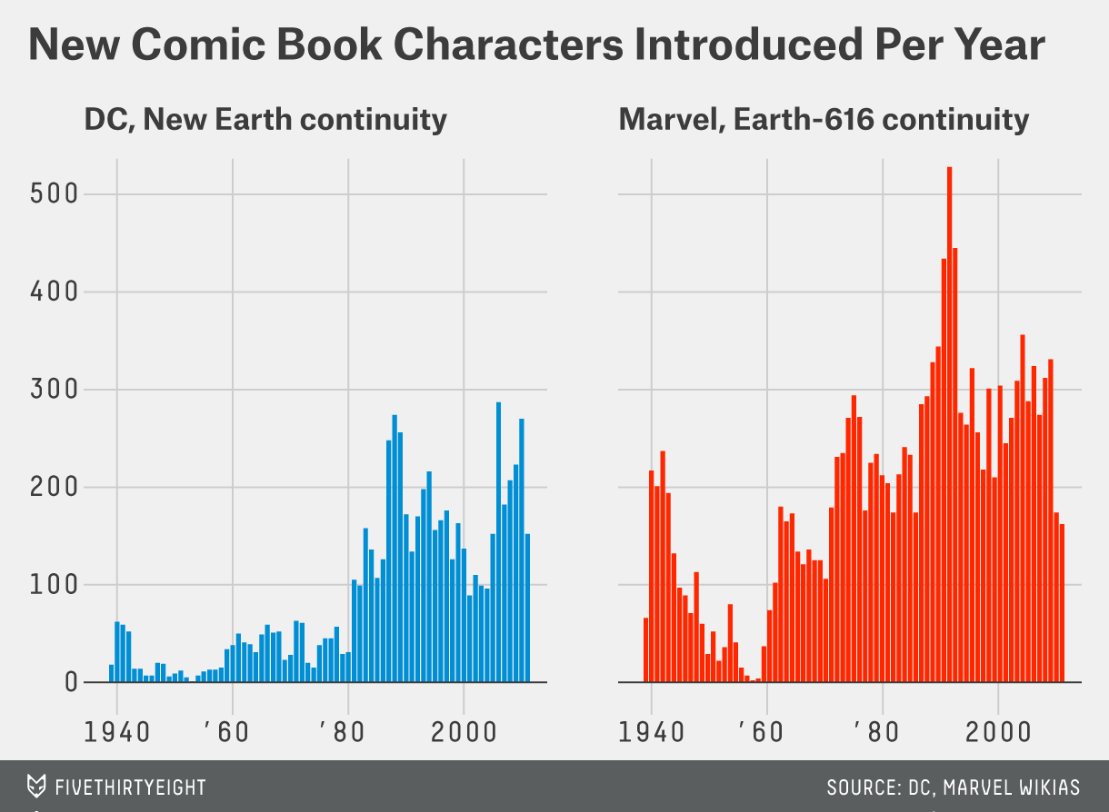
My graphic comes from Comic Books Are Still Made By Men, For Men And About Men.
Here is the graphic I want to reproduce:

Here is some pseudocode
ggplot(comics) +
   geom_histogram(aes(x=year)) +
   facet_wrap(~publisher)
First draft
Your next step is to do the quick, sketchy version of your graphic in code. Here’s an example from a past class.
p1 <- ggplot(comic_characters) +
  geom_histogram(aes(x = year, fill = publisher), binwidth = 1, color = "white", lwd = 0.1) +
  facet_wrap(~publisher) +
  theme_fivethirtyeight() +
  scale_fill_manual(values = c("#008fd5", "#ff2700")) +
  labs(title = "New Comic Book Characters Introduced Per Year")
p1
For the first draft, I want you to upload a .html file rendered from a .qmd file. It doesn’t have to have many lines of code in it (in fact, I think a good draft usually only takes 6 or so lines!), but it should include a version of your visualization that is at least part of the way to reproducing the original graphic. In particular, it should be the right “form” of graph (if the original is a barchart, it should be a barchart, not a scatterplot!). It’s okay if there are more categories than the original, or if the axes are off, etc.
Here’s another example, of an original graphic from 538 and what I would consider a draft of the graphic.

chess_transfers |>
  group_by(federation) |>
  summarize(total = n()) |>
  arrange(desc(total)) |>
  slice(1:10) |>
  ggplot() +
  geom_bar(aes(x = federation, y = total), stat = "identity") +
  coord_flip()
There’s a lot missing in the draft– it doesn’t have the right colors, the names still aren’t right, and the order is off! But it’s the correct “form” of graphic.
Peer editing
Final draft
The last piece is to get your graphic to look as similar to the original as possible. We’ll do some peer editing and I will provide feedback about things that I notice that should be matched, and we’ll demo this on the example graphic as well.
For the comic characters, here is a (mostly) final draft:
publisher_labels <- c(
  DC = "DC, New Earth continuity",
  Marvel = "Marvel, Earth-616 continuity"
)
p1 <- ggplot(comic_characters) +
  geom_histogram(aes(x = year, fill = publisher),
    binwidth = 1,
    color = "white", lwd = 0.2,
    show.legend = FALSE, alpha = 0.9
  ) +
  facet_wrap(~publisher, labeller = labeller(publisher = publisher_labels)) +
  scale_x_continuous(
    limits = c(1938, 2010),
    breaks = seq(1940, 2000, 20),
    labels = c("1940", "'60", "'80", "2000")
  ) +
  scale_y_continuous(limits = c(0, 555), breaks = seq(0, 500, 100)) +
  scale_fill_manual(values = c("#008fd5", "#ff2700")) +
  geom_hline(yintercept = 0, color = "grey31", size = 0.5) +
  theme_fivethirtyeight() +
  theme(
    axis.text.y = element_text(size = 14, face = "bold", family = "mono"),
    axis.text.x = element_text(size = 14, face = "bold", family = "mono"),
    plot.title = element_text(size = 26, hjust = 0.5),
    strip.text.x = element_text(size = 18, hjust = 0, face = "bold"),
    panel.spacing = unit(2, "lines")
  ) +
  labs(title = "New Comic Book Characters Introduced Per Year")
p1
Deliverables
- Friday, February 28: choice of graphic, and “psuedo-code” of how you think it will be doable
- Friday, March 6: first draft of graphic, around 6 lines of graphics code
- Friday, March 13: final draft of graphic, as many lines of code as it takes!