Week 11 viz: Interactive viz
You can make interactive data visualizations in either R or Tableau!
Tableau
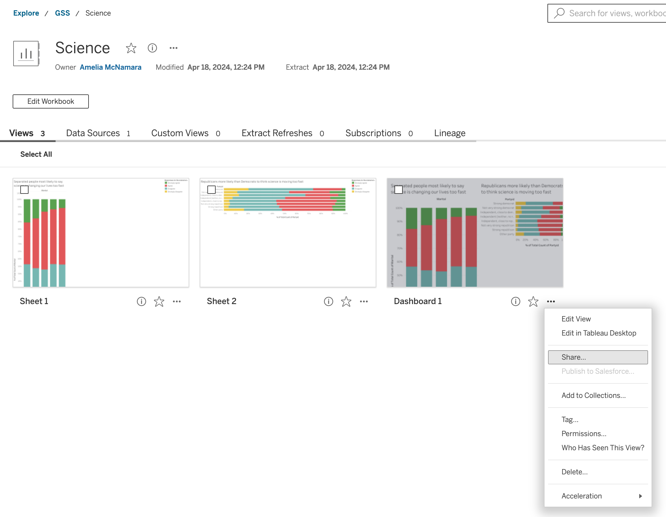
One benefit of Tableau is that you get interactivity (brushing and linking) “for free.” They also do some device size customization for free, which is one of the things people talk about with dashboards. Lots of people make dashboards using Tableau. Some examples:
- The Coffees of Twin Peaks
- Michigan 34, Washington 13: The 2024 College Football National Championship Game
- Edmonton, Alberta: Snow
- Press Freedom Index : The Dire State of Authentic Journalism in 2023
- Ránking de sueldos: El lugar de la Argentina donde se cobran los mejores salarios, pero no es fácil ser feliz
- Popular or Pragmatic Part 2: The Long View
- From College Major to Industry of Employment
- Surface with Purpose Tool - by jurisdiction
(Data filters are the hardest part of Tableau dashboards, in my opinion.)
R
In R, it takes a little more work. If you want to make a fancy dashboard, you probably need to use the Shiny app. Here are some examples of Shiny dashboards:
- Regional Parks and Trails Equity Tool (Met Council)
- COVID-19 Surveillance at the Metro Plant (Met Council, deprecated)
- College Basketball Referee Logs
- 2024 US-Aid Funding
- Fusarium graminearum database
It’s a bit outside the scope of this class to make shiny apps, but I recommend the book Interactive web-based data visualization with R, plotly, and shiny, by Carson Sievert, as well as the main page for Shiny on the Posit website.
However, there is an easy way to make any ggplot2 graphic interactive– the plotly library, accessed through ggplotly!
- Quarto doc with a little code
Viz of the week
For this visualization of the week, I’d like you to try to create an interactive graphic or dashboard (in Tableau or R). Clean up the labels, titles, and data filters. Ideally, you would use GSS data (either from NORC or my download), but any data is fine.
Submit something to show me you made an interactive visualization.
Preferred submission: a link to an interactive dashboard on Tableau Cloud, or a rendered HTML document from Quarto that includes the interactive viz. I believe that if you publish your dashboard in Tableau Online, you can share the link to your dashboard with me and I can see it. For example, here is a dashboard I made.
Copy the link and submit to Canvas.
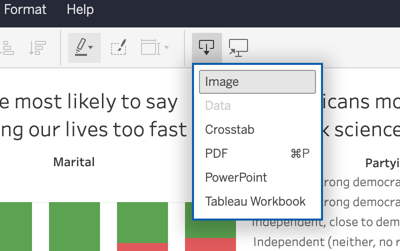
Okay submission format: downloaded version of your Tableau dashboard as an image.
Acceptable: screenshot of your dashboard or interactive viz.